
Liliana.
Azmi-Galoczi
Production
The very first lesson with Paul, we learnt the basics of Adobe Illustrator (Adobe, 1987) by making basic shapes and lines, straight or curvy, with the pen tool with a worksheet, ny Paul, imported into the program to work through. We were then introduced to some keyboard shortcuts, introduced to tools that allows you to divide/merge/ungroup shapes, and how to make neat and precise shapes. Personally, this was a great start for me as I learned the tips and tricks of Illustrator.
After we made our way through shapes and lines with the pen tool, we then were assigned to replicate a logo of a monkey through a template. It was a slow process but I only just managed to use the ellipse tool (as it was a very round monkey). I didn’t manage to finish it but this opened my mind to vector art - but to more about it, since I made vector art before with Assembly (Pixite Inc., 2017), an IOS app for logo designing.


Then in the beginning of our second lesson, we tested our memory on using the pen tool from the previous week to master our skills of the pen tool. This was a very good way of improving our skills - use of repetition until you master your discovery. We were then assigned to start designing our game logos by sketching. Ideally, we had to repeat our designs to find an optimal design that can be used to fully design on Illustrator as the final production. For this, as explained in the pre-production tab, I planned myself to design a funky, fun and for kids, yet western to maintain the western theme of the game.
Then in our third lesson, we were introduced to more shortcuts with the bezier handle (a passive tool that allows you to modify curves of a perimeter) and how to vectorise an image from Photoshop by making the image more crisp and clear by increasing the contrast and brightness, and then also increasing the threshold to a certain extent. Then import it to Illustrator to be vectorised. This way, it’s easier to import your clear and confirmed sketch of your logo to be vectorised to make it the final logo, then all it needed was some colour and details of your choice. But I chose to create mine manually: vectorise my rough logo sketch then use it as a template to make over it manually. I chose this method of my logo production because not only does this improve my uses of Illustrator skills, but also because I was a bit lazy… as I didn’t want to make another sketch with clearer outlines to be vectorised with ease. However, there wasn’t much tasks left to do in the lesson, as the Macs in the classroom lacked internet connection, or had incredibly slow internet - either way, it was hard to proceed with other work. So to improve my Illustrator skills and proceed with production, I manually started making my logo of Cooper Defence. So I decided to use my messy logo as a template to fully produce my logo over. So I created another layer where I started to begin creating my logo by outlining the letters with the pen tool - which, personally, was fun! Because since I already held the skill of handling with the bezier handle from Assembly, this was quite easy so this flowed nicely.
But then I came across to my lettering of DEFENCE. I planned to make the font western. So I had to search for western fonts from Adobe’s collection and from dafont. The teaching assistant, Dee, suggested me an idea that I search for western fonts and make a collection of the fonts I like onto the canvas. This is to show some research of development for logo creating. But this idea did, indeed, help me grasp an idea of western fonts and find my ideal font for the logo. Once I made my personal western collection, I then proceeded to outline the wooden tablet of the logo. As I finished, I also outlined the additional perspective of the tablet - making it look 3D, to make it as if it’s popping out of the game sleeve into the consumer’s face - making it eye-catching and reflecting the gameplay’s personality. However, these outlines were separate to main outlines of the tablet. So this made it difficult to colour in the space between the main outline and the outline of perspective. So I called Paul for help. He made coloured rectangle and put it behind the outlines. Merged the shape and the entire tablet together, then divided and ungrouped them - resulting the ability to delete any remainings of the rectangle. And there, the space between the main and perspective outline was filled with colour. So there, I learned how to fill in colour with separate outlines! But I forgot after a couple of days... so I’d need to review it again to develop this skill.

When Tuesday returned, we learnt how to work with another Adobe program: InDesign (Adobe Inc., 1999), an industry-leading page design & layout tools for desktop & digital publishing. This was for us to prepare ourselves for game sleeve production. This will be further explained in the game sleeve blog. However, the day before this class, as I researched about cliches and stereotypes I realised the desk I was working on: wood with no paint but just plain plank of wood as a desk. It made me realise about my logo for DEFENCE, since I planned it to be on a wooden tablet. So I realised how the wood I found could be suitable for the logo, except, this type of arrangement of the wood isn’t appealing to my ideal plan for DEFENCE, because it was actually not set in planks, but an endless arrangement of the wood’s fibres and lines. Therefore, this wouldn’t be suited for a western theme of my game, as this wood would, perhaps, be more suited for a modern environment.
Proceeding with the happenings after we completed learning the essentials on how to use InDesign for our game sleeve, we continued with tasks we needed doing ourselves. I wanted to continue with my logo, however, I noticed that the logo was not saved properly to my online email, which, therefore, I had to restart my proceeding work I did the week before… Internally, I was highly annoyed - the deadline was edging closer! But I simply had to oblige myself to restart - the week after! Despite that, I came early to college once again to begin my restart for my logo. It was uncomfortable sitting in one place for some hours, but this work did a decent majority of the logo’s progress. I outlined the remaining letters that were not saved, as well as the wooden tablet. I then repeated the colouring for the 3D-like effect process Paul showed me before, except, I ran into problems as I did that process - because I forgot how to do it, and there was no one in the classroom but me. So I quickly resolved a solution: since the 3D-like effect outline was separate to the main outline, I simply made the 3D-like outline into a shape by joining both opposite ends and arranging the shape behind the main shape. So when colouring it in, it does not overlap the main shape. This solution was definitely a solution. It was quick and easy to process through. This method was applied to the letters and fire emblems.
After I finished creating the logo in Illustrator, I saved it as an ESP file so that it’s compatible with Photoshop to be modified, as I’d need it to be finalised in the program. After importing it, I began finalising. On that day, I was very tired and cold because of the illness from last week that slightly continued to that day, which made my work pace slow. Either way, I completed the logo, apart from the fact that I still needed DEFENCE’s font onto the wooden tablet, which needed downloading from Dafont and import it into Adobe’s font collection. However, apparently the computers didn't let me import the font into the collection. Reasons - I still don’t know why, but the Mac computers in the other room allowed this ability. Nevertheless, I left this task till next Tuesday - where our lesson took place in the Mac room. However, while I was finalising the logo, I completed the production of adding tones to the logo - mostly the burn tool (darkening tool) and dodge tool (lightening tool). Since I didn’t want to add textures to maintain within my target audience, I, instead added tones to the logo. I darkened the bottom of the letters, tablet and emblems, then lightened the top of the logo. With these tools, I used the magnetic lasso tool. This tool calculates where the outlines are and magnetically remains within the outlining, making it easier to keep a neat selection. I used this tool to reduce mess and keep within the shape I wanted to colour. However, I noticed that these tones were gradual. And the appearance didn’t appeal to me very much. So I returned the method I used before when I was producing Cooper: use the burn tool and paint a dot over it to be colour picked. Then use the new colour as a shade. But then I realised that the entire logo was on one layer, because that’s how I imported it from Illustrator, making the colour overlap the logo’s outline. This annoyed me as I had to return to the original work, but it did not matter as much, since it satisfied my views in the end.

However, as the next day progressed, after my evening badminton session, waiting in the cafe to be picked up, I noticed the flooring was also wood, but noticeably different, and better than the wood I found at college. Except, this wood seemed darker than what I planned, since I needed a palette of lighter colours for my game to suit my target audience. However, the wood would still be suitable for my game, because the setting of the wood arrangement is certainly western - in my opinion. But it would need some modifying to make absolutely certain that it’s suited for the western theme. Nevertheless, I could supposedly use this texture as a reference for my DEFENCE, but most likely for outlining and shape and not colour, since it’s a darker colour in comparison to my planned palette.


Logo:
Reference:
Dafont.com (date unknown) No title [Online]. Available from: https://www.dafont.com/theme.php?cat=106 [Accessed 21 September 2019].
Adobe Inc. (1987) Illustrator [Computer program]. Available from: https://www.adobe.com/uk/products/illustrator.html?gclid=CjwKCAjw9L_tBRBXEiwAOWVVCf98bM7pDvdZpUfT3zqGsmuvXgandmBlz1PEo4RYqtCNkhFp8WMnhhoCHJkQAvD_BwE&sdid=88X75SKR&mv=search&ef_id=CjwKCAjw9L_tBRBXEiwAOWVVCf98bM7pDvdZpUfT3zqGsmuvXgandmBlz1PEo4RYqtCNkhFp8WMnhhoCHJkQAvD_BwE:G:s&s_kwcid=AL!3085!3!340693275319!b!!g!!%2Billustrator%20%2Badobe [Downloaded by the college].
Adobe Inc. (1990) Photoshop [Computer program]. Available from: https://www.adobe.com/uk/products/photoshop.html?gclid=CjwKCAjw9L_tBRBXEiwAOWVVCWFVExukMb-6mP9VHhsS2oaaBsHHmhihrdr5LfCQS1QVPP05O3ca-BoCKA0QAvD_BwE&sdid=88X75SKR&mv=search&ef_id=CjwKCAjw9L_tBRBXEiwAOWVVCWFVExukMb-6mP9VHhsS2oaaBsHHmhihrdr5LfCQS1QVPP05O3ca-BoCKA0QAvD_BwE:G:s&s_kwcid=AL!3085!3!385303406159!b!!g!!%2Badobe%20%2Bphoto%20%2Bshop [Downloaded by the college].
Adobe Inc. (1999) InDesign [Computer program]. Available from: https://www.adobe.com/uk/products/indesign.html?gclid=CjwKCAjw9L_tBRBXEiwAOWVVCYH_VyRnpagGLcA397h3KVXPOahh3IxXj-B3P9P5BdQV7KFp8FhAMBoCRuMQAvD_BwE&sdid=88X75SKR&mv=search&ef_id=CjwKCAjw9L_tBRBXEiwAOWVVCYH_VyRnpagGLcA397h3KVXPOahh3IxXj-B3P9P5BdQV7KFp8FhAMBoCRuMQAvD_BwE:G:s&s_kwcid=AL!3085!3!385303406141!b!!g!!%2Badobe%20%2Bindesign [Downloaded by the college].
We were not given tutorials on the basics of Photoshop (Adobe Inc., 1990), since we learned them last year of year 1. I first started the background with a solid, plant-like green to start with from there. However, I used an image of gameplay from Juicy Realm (SpaceCan, 2018), since the background is inspired by the game because the flooring has my ideal background idea for my game. So I did a method of observational drawing by mapping out the exposed patches of the floor (patches without grass so dry soil), then added some dots of the darker yellowy brown - sandy - for tone and texture. I then changed to more of a textured brush, changed the green colour to darker, set the opacity to 60% and increase the brush size. Then splodge it in few places - not too many though, as the blending would make the entire flooring dark, not enabling viewers to recognise the actual texturing of the grassy land. Then I switched to the mixture brush, and gently swish it against the edges of the exposed patches and swish and swirl around the darker patches of the grass. I found out about this brush through a video by Ross Draws - it's a very useful brush, as it blends everything beautifully.
However, as I blogged about my production, I realised that I wouldn't have enough time to complete the essential production tasks - game logo, game sleeve, level background, character development, HUD development and game development on Unity. So I got quite agitated and worried that I'd never get the grade I wanted for this project because I don't have the resources to do these tasks at home, such as Photoshop (Adobe Inc., 1990), Illustrator (Adobe Inc., 1987), Indesign (Adobe Inc., 1999) or Unity (Unity Technologies, 2005). Until I realised that I have Krita (KDE, 1998), a digital drawing program, and a drawing tablet - meaning I can create the level, freely from home, for my game, so that's a plus one to efficiency. Unfortunately, I couldn't import my work from Photoshop, from school, because I saved it as a Photoshop work, nor did I save it to a memory stick. Therefore I had to start again from scratch, but that I didn't mind, because it didn't take long to make what I made again from the Photoshop work - paint the entire canvas in a luscious dark green that's mixed with a lighter green, to ensure the colours suit the target audience. And then paint some dry patches of the land for decoration and detail.
Blending the dry patches with the grass was quite the layering of steps without layers... After painting out the patches, I then painted a darker colour of the patch with a small line or dot. Then blend the outline of the patch with the smear brush, and again with the blur brush, and then blend again with the flat watercolour brush to expand the patch. Then paint over the outline with the main green colour of the canvas with the charcoal_rock_soft brush for a grassy effect around the outline of the patch. And then spread the darker colour of the patch for detail. And then paint over the patch with the main colour with the chalk_grainy.
A lot of steps... But it resulted decently! For my beginner's skill of digital drawing. However, for a tad more detail, I used the charcoal_rock_soft brush but larger and lower opacity, for a few splotches in some areas to texture the ground.
However, as I explored through Krita’s set of brushes, I reached the end of the list, where the stamp brushes are held, such as grass, water reflection, mountains, leaves sparkles, herbs, grass patch, floor, and much more. I equally like these brushes as much as I don’t like them. Because firstly, they’re great for easy, efficient texturing, yet, I don’t like them because they’re cheating! But I simply had to use them for the sake of efficiency - I mean… the project is short.
As a result, I textured the land and dry patches a bit more with the stamp_grass brush.

Trees & bushes:
Again, the design of the level is inspired from Juicy Realm, so I took the majority of the design ideas from that game - mainly because I wasn’t confident in how to draw a tree digitally, so I needed a boost by grasping a concept from Juicy Realm’s trees. I started off by using the bristles-2_flat_rough to outline the main texture of the tree trunk with brown, then colouring in the rest of the trunk in straight swishes. Then, I stumbled upon struggling with how to draw the tree’s leaves. I tried copying the idea from Juicy Realm, but the set of leaves happened to make the entire top of tree unusually round - quite extremely round. But I thought I’d keep this design since it was my initial plan of overall shape design of the game: round, to maintain my target audience. Again, I used a set of steps to satisfy myself with the tree, so first, I used the basic hard brush to outline the leaves with a light green colour. This is also to shape the tree, then colour the bottom of the leaves with a darker colour, for later’s blend of colours. I then filled the spaces with the base colour (the first colour I used). Then blended together with the smear tool. I then outlined the leaves with black for the cartoon-like look to stabilise the idea for the target audience. And finally, I used the stamp_leaves brush to highlight the leaves, as well as texturing them.
After that, I proceeded with the trunk, I outlined minor details by making a hole and some lines with black to detail the tree. Once I slightly textured it, I textured it further with a lighter brown with the same brush I used to colour the trunk, but then I textured it even more with the chalk_grainy brush with the base colour. This method of steps applied to the other two trees, two bush designs and grass patches, except their shapes are slightly different as well as colour. However, overall, I was satisfied with my efforts as a beginner of digital drawing. I agreed with myself that the design is suitable and appropriate for my target audience, especially if it’s outlined quite boldly in black.


Arch & rock:
This part of the production I was worried about, since, again, I’m not used to producing digital art. So I looked up two tutorials about how to draw rocks on Krita. One video was ambitious enough to manually go through steps of colours and brushes, whereas the other simply conveniently cheated by using some stamp brushes to automatically create a rocky texture - but that was the video I mostly followed - but I did also follow the ambitious video, since the video with the cheating presented the brushes that the artist bought with money - hence how they got the perfectly textured rock in under thirty seconds - more or less. Despite that, I combined both the skills the two videos conveyed: using one of the stamp brushes to start up the base colour and texturing, then from the ambitious video, use the marker_dry brush to define the arch and rock’s cracks and rough edges. Enable the audience to recognise that what I drew is, indeed, a rock. However, because I planned to colour my rocks and arch in dark red, to assure the western theme to the game, as I produced the arch, it looked like a concerning arch made of flesh - as if fresh meat, like a structure from Scorn (Humble Bundle, 2017), where everything is made of bones and flesh - a biomechanical environment.


The same applied for the rocks, except I changed the plan and made them smaller because of time management. In relation to time management, I decided to not produce the cliff wall to border the top of the level, because I figured it would take up space, because I overestimated the canvas measurement and it happened to be small as I drew. Other than that, I didn’t create the cliff edge because I had to continue with other tasks for the project, as there were only two weeks left - edging closer to one week. This, unfortunately, also included for the awkward item placement and hidden alcove. However, personally, the level design matched my blueprint (of course not entirely), and is suited for my target audience, despite my beginner’s level of digital drawing.


Level background:
Nevertheless, I did not want that feature in my game, because, obviously, my game is made for boys ages 7-11 - therefore, it’s a young audience, so playing in a biomechanical environment is horrifying enough - personally. So to avoid that, I used the airbrush_soft with the colour grey and a low opacity and swished across the arch. It improved in appearance, appearing increasingly less concerning and more of an arch that I ideally wanted. I then used the burn and colour dodge/lighten tool to define the shadows and light reflection on the arch, as well as define that Cooper can walk through it by walking under it - hence the shadowing on the side.
Reference:
Dafont.com (date unknown) No title [Online]. Available from: https://www.dafont.com/theme.php?cat=106 [Accessed 21 September 2019].
KDE (1998) Krita [Computer program]. Available from: https://krita.org/en/ [Downloaded 2 February 2019].
Adobe Inc. (1990) Photoshop [Computer program]. Available from: https://www.adobe.com/uk/products/photoshop.html?gclid=CjwKCAjw9L_tBRBXEiwAOWVVCWFVExukMb-6mP9VHhsS2oaaBsHHmhihrdr5LfCQS1QVPP05O3ca-BoCKA0QAvD_BwE&sdid=88X75SKR&mv=search&ef_id=CjwKCAjw9L_tBRBXEiwAOWVVCWFVExukMb-6mP9VHhsS2oaaBsHHmhihrdr5LfCQS1QVPP05O3ca-BoCKA0QAvD_BwE:G:s&s_kwcid=AL!3085!3!385303406159!b!!g!!%2Badobe%20%2Bphoto%20%2Bshop [Downloaded by the college].
Ross Draws (2019) ‘Illustration Master Course - Ep. 5: STORYTELLING & PRESENTATION’ YouTube. Available from: https://www.youtube.com/watch?v=dK91woAn8TI [Accessed 6 October 2019].
GDQuest (2016) ‘Krita brushes tutorial - How to use the color mixing brushes’ YouTube. Available from: https://www.youtube.com/watch?v=P5XZVx7yYP4 [Accessed 13 October 2019].
ruzzi (2017) ‘| Krita Speedpaint | Let's Sketch and Paint some Rocks!’ YouTube. Available from: https://www.youtube.com/watch?v=fyl9pczoWco [Accessed 13 October 2019].
iforce 73 (2017) ‘Krita - Easy way to draw Rocks’ YouTube. Available from: https://www.youtube.com/watch?v=56d28q5VrjY [Accessed 13 October 2019].
Our first scripting lesson was on a Thursday three weeks before the deadline. Since scripting was my second option for a job role for the next project, this lesson hit me with interest. And even more so when we started to make our own scripts. But before we began with that task, we started off with a quiz with images of games blurbs, also known as a razer. Our fun task was to guess what game it was by reading the razer, but then also explain how it presents the theme of the game in terms of font, use of vocabulary, language and tone. This helped us understand our razers, understanding over how we can plan to write our razers to suit our target audience, theme and genre. As for myself, I was struggling with my blurb for my game. It had to be catchy yet serious because Cooper has to defend the west, and it had to suit for boys ages 7-11. So I looked up the games Lego Indiana Jones 2: The Adventure Begins (LucasArts, 2009), Lego Batman: The Videogame (Warner Bros. Interactive Entertainment, 2008), and Sonic Unleashed (SEGA, 2008) for their use of vocabulary they use to attract their young target audience that was similar to mine. I picked up words and phrases such as “A new adventure begins!”, “spectacular action adventure”, “Gotham City is falling to pieces!” and “Play as Batman and his sidekick Robin as you build, drive, swing and fight your way through Gotham City”. But if we compare these picked out blurbs to a horror game, for example, Resident Evil 7 (Capcom, 2017), their razer presents:
“ A mysterious message leads you to a sinister plantation mansion in rural Louisiana, USA. With danger lurking in the shadows of every hallway and the insane Baker family hell-bent on killing you, piecing together every clue and uncovering the unspeakable truth will be the key in your fight to escape alive. WILL YOU SURVIVE? ”
This razer clearly shows the game is PEGI 18, which would mean:
The adult classification is applied when the level of violence reaches a stage where it becomes a depiction of gross violence, apparently motiveless killing, or violence towards defenceless characters. The glamorisation of the use of illegal drugs and explicit sexual activity should also fall into this age category. - PEGI (Interactive Software Federation of Europe, 2003)
So this shows a violent and graphic environment in the game, which would make the children have nightmares and trauma of a lifetime… However, the font of the razer seems strong and firm. Especially with the big writing of ‘WILL YOU SURVIVE?’, as it has texture to it, perhaps a liquid squirt, or something sharp was scratched against it. Either way, the question is big and bold, especially by how it consists of the word ‘survive’ implies that the game is about surviving through a game of horror through a house of an insane family. The phrase ‘hell-bent on killing’ sounds as if it’s a very intensive survival, but by ‘hell-bent’, it, perhaps, connotes that where the main character is surviving through, feels like hell - difficult, terrifying and suffering. In addition to this, the game sleeve’s base colour is mostly black and very dark grey with a texture of, supposedly dark metal, or other sturdy material that's been used for a very long time, resulting in countless scratches. This could reflect the main character’s frequent impact on his health against the enemies - frequently attacked, like the dark material shown as the background. Other than that, the background is a very dark colour, which, semiotically, defines death, gloom and mystery - hence the ‘danger lurking in the shadows of every hallway’.
Another game razer, LittleBigPlanet (Sony Computer Entertainment, 2008), is an absolute opposite to Resident Evil 7’s razer. The background colour is pink and the letter font is bold, round and sweet. As well as the use of vocabulary, the words and phrases such as “Welcome to LittleBigPlanet”, “an amazing new world”, “anything is possible”, “in the search for clever creations”, “cool stuff” and “share the fun”. These phrases have a large contrast to the Resident Evil 7, that is because this pink and fluffy game is targeting players who are female, or both genders, PEGI 7. The font and certain use of words, indeed, makes the game seem ‘cool’ and ‘stuff’. But under seriousness, by how the razer is presented, it makes the audience believe that ‘anything is possible’ in the game with a welcoming introduction, because they can ‘build your own unique content’. In addition to the lettering, it’s round, which connotes a free sense of movement, energy and wholeness, which reflects the young children’s personality. In terms of colour, the game sleeve’s base colour is pink, which also connotes friendship, harmony and approachability, which is perfectly appropriate for young children ages 7 and older.
Overall, Resident Evil 7 has a high contrast to my picked phrases and words, because, of course, it’s a horror game for PEGI 18, so it’s not suitable for my audience. However, on the other hand, LittleBigPlanet is similar to my style of my game make, except, LittleBigPlanet is leaning towards the feminine side of the target, since the background colour is pink, which is a highly feminine colour. Nevertheless, the LittleBigPlanet game opened an idea to me about how to write up a razer for my game. So I wrote
THE WEST IS BEING INVADED!
In the land of the Mythical West, all was civil until the creatures of the south fired up with a desire to claim more land so they headed for the west by force. Citizens became feared and threatened. Cooper, the fireslinger, noticed his homeland being brutally disturbed and so he charged at the enemy creatures with his fired up flames to defend the Mythical West. Will he successfully defend it with his emblems of flames?
The writing in capitals was the idea from the Lego Batman: The Videogame (Warner Bros. Interactive Entertainment, 2008), a warning, as if from the citizens of the city, calling for help to the players, as Batman, to help protect the city from enemies, which influenced my razer introduction. Then, as I wrote in the rest of the razer, I tried to remain within the young masculine language, yet reveal the story of what happened to the west but, obviously, not uncover the ending of the game - since that is under the players’ responsibility, hence the rhetorical question at the end: “Will he successfully defend it with his emblems of flames?”. In terms of theme, my razer clearly reveals the themes western and fantasy. Firstly, western is portrayed by “THE WEST”, “West”, “fireslinger”, and “Cooper” (Western name). Until the fantasy theme is merged - “Mythical”, “creatures”, “fireslinger” (fantasy version of gunslinger) and “emblems of fire”. Simply by merging both themes with “Mythical West”, is a distinct implication that my game will consist themes of fantasy and western - which is what I initially planned to make. In terms of genre, by how the razer is written, supposedly it reveals an implication of a top-down game. But the razer mainly focuses on the story of the game, and questioning whether the player will manage to defeat all enemies in the game. Whereas for a platformer game, perhaps with this razer, it wouldn’t be suited for a platformer game, because for a run ‘n’ gun top-down game, players have the ability to explore the area as they defeat enemies.
Then we proceeded to the next task. We were introduced to a script example under Syd Field’s method of scripting, otherwise known, all medias use Syd Field’s method. Because it’s the most effective and efficient way of assembling the stage for theatre/shooting scenes for TV and even video games. We were introduced to environment setting, so is it interior/exterior, day/night, and location - in a slugline (environment setting highlighted in grey, if it’s at the start of page, otherwise not). How characters come in with speech by How they speak it and how they express their body language. How and where the camera is shooting. And describing the setting to enable environment assemblers know what to set for the stage, scene or game cutscene - also known as the establishment shot.
After learning the essentials of Syd Field scripting we were assigned to make our own scripts under Field’s influence, as well as writing it with the Courier New font to maintain the traditional script writing for any platform of media. As well know, we were all assigned to make a game of one level, and because this project is minuscule in length of duration till the deadline, it’s most likely all of us have very short stories - or possibly none. So my storyline for the cutscene is, of course, short. But as I wrote my script, the passion of script writing from two years ago when I was scripting dialogue and descriptions for a roleplay for my friends on one of their realms - the fun of how our imaginations of fantasy and mythical creatures came to life through the scripts to story flourished once again as I wrote the current script for Cooper Defence. However, indeed, I, unfortunately, had to remain this storyline at a suitable length for this tiny project.


Scripting:
Establishment shot - With this part of the script, I became carried away by my descriptive writing with metaphors and adverbs, but that was what I soon realised, drifting into my own bubble of fully describing a scene. Whenever that happened, I had to constantly pop this bubble. Gradually, in the end, I maintained my setting to a concise description.
Camera - With this, I had many ideas of how to present the cutscene in my head - genuinely all animated. But the camera shots were mostly anime inspired. Despite that, the ‘RAPID PANNING’ implies that there danger has approached, a caution towards the enemies. And an introduction to the players that these characters are enemies to the Kesten citizens and Cooper. The last shot of the cutscene is another rapid panning to Cooper. Even though I explained that this method of camera shots connotes a sense of alarm and caution towards danger. However, this pan to Cooper, implies that help has conveniently arrived to rescue the day and clean the invasion.
Enemies - Even though the script is small, by how the enemies are presented with how they ‘arrogantly shouts’ and ‘furiously shouting’ clearly conveys their fiery desire to conquer Kesten City. In addition to this, personally, I can sense their determination and anger. And then their confused reaction when Cooper disrupts their invasion.
After I sent my script to my tutor, Lizzy, for feedback, Lizzy talked me through about my script. So far there were no errors, apart from I had numbers next to each line - because I thought that was what we had to do for our script. And that I didn’t have a script for the level, but the cutscene. That, I realised I forgot to do the script for the level. So straight after I came home from college, I quickly, yet keeping myself within the zone to keep it concise and flawless, wrote the script for the level. However, I realised that my level does not have any activity but running ‘n’ firing the area against enemies. Even though it was unlikely to really happen, I added speech at the end of a win, from Cooper, and a loss, from Sneken. As an opportunity to if I was to legitimately add this to my game. Nevertheless, I completed the task of making a script for my game’s level.

Cooper - As Cooper’s speech was edging closer, I couldn’t think of how he could introduce himself into the scene, to the players. I initially thought of him as a fun, reckless fireslinger - but I still wanted him to be the type who’s still cautious of their actions - at least sensible. So I introduced him by him ambling into the scene, until he notices the ruckus and becomes confused and angry - Cooper’s mini sensible moment. But then his recklessness fires up with a “Now this gets me fired up!”. This line was inspired by an anime character from Fairy Tail (Kodansha, 2009) called Natsu Dragneel, a reckless fire wizard. As this is to Cooper’s influence, I’ve always loved Natsu’s “fired up” lines, because it’s motivational and as watchers, it also fires them up because it gives them a start to do something. Therefore, as Cooper’s catchphrase is also “fired-up”, resulting my audience to also feel their fire and motivation. But originally, Cooper’s catchphrase just fluttered into my mind as I wrote the script, without thinking about the reason behind Natsu’s influence and why he says his catchphrase to the audience.
Proceeding with Cooper’s introduction, he obliges the invading enemies to face him first before their invade any further, with an angry, yet confident smile. I wrote this into the script because this is also under Natsu’s influence, but it’s also to tell the audience that they mustn’t let fears overtake them and never give up what was positively a part of you - home, hence Cooper defending the west, his homeland. However, supposedly, this is a sign of arrogance, so that’s one of Cooper’s downsides.
Reference:
Fairy Tail (2006) Directed by Shinji Ishihara [Anime series].
Sonic Team (2008) Sonic Unleashed [Computer game]. SEGA.
LucasArts (2009) Lego Indiana Jones 2: The Adventure Continues [Computer game]. Traveller's Tales.
Warner Bros. Interactive Entertainment (2008) Lego Batman: The Videogame [Computer game]. Traveller's Tales.
Capcom (2017) Resident Evil 7 [Computer game]. Capcom.
Media Molecule, SCE Cambridge Studio, Tarsier Studios, Double Eleven, XDev, United Front Games, Sumo Digital (2008) LittleBigPlanet [Computer game]. Sony Computer Entertainment.
PEGI (2007) The PEGI age labels [Online]. Available from: https://pegi.info/ [Accessed 9 September 2019].
Monica Beyer (2018) 40 Western Names Perfect for Your Little Cowboy-to-Be [Online]. Available from: https://www.sheknows.com/parenting/articles/982071/western-names-for-your-baby-boy/ [Accessed 3 October 2019].
On a Friday, three weeks before the deadline, I decided I should begin on character development if I have the tasks broken down for level background and logo designing. It took me a while to start because digital drawing daunts me, especially when drawing with a tablet without a screen but a blank, black space. In other words: I’m more of a traditional drawer, so I’m not used to drawing without seeing my hand drawing. So I did sit there for a good ten minutes trying to think of how to finally start the process of animating Cooper’s running. But I then had an idea that I trace Cooper’s running that I already drew. So I downloaded the image that I took from my phone. Imported the image to Photoshop (Adobe Inc., 1990), and started being stuck again… Although, initially, I had the idea of outlining Cooper first, then create a layer below for colouring in. This way, when colouring, the colour that underlays the outlining is under that layer, making it easier to erase any overlapping colouring without erasing the outlining because it’s in a different layer.
Proceeding, before I did the outlining, I searched for the video I watched last year about smoothing, or also known as stabiliser in other art programs. This tool automates your brush to maintain a smooth and stable outline, preventing any shakey or rough edges. This is useful for anyone with unstable hands or to create precision and neatness to your work. This tool, I needed since the art style of my game is cartoon, round and simple, so this tool was much needed. I also watched another YouTube video about digital drawing for beginners. The video presented essential and handy features of Photoshop and alternatives. Such as liquify and transform, clipping mask, shortcuts and much more. These videos, combined, motivated me to begin my work for Cooper’s full production, confirming my initial ideas on how to assemble him along the way.
_JPG.jpg)
Tuesday two weeks before the deadline, I decided to come early to do extra work because of the resources I don’t have at home, for example, Photoshop (Adobe Inc., 1990) and Illustrator (Adobe Inc., 1987). So I came in to proceed with Cooper’s running animation, except the animation didn’t start yet till the upcoming Friday that week, because I had to continue with the further colouring and shading for Cooper.
I first started with the eye colouring, which was quite the struggle since I’m not used to drawing without seeing my hand doing the drawing - traditional drawing is what I’m used to, to put it simply. So it took a lot of clicks of undos until I got a perfect outline for Cooper’s eyes. For his eyes, I first coloured it with two colours, one dark blue as the outline and shade under the eyelid, and one light to define Cooper’s eye colour. However, as I shaded in the eye with the burn tool, it didn’t appear as the best production, so I added another colour of blue, a blue that was in between the light and dark, that would also in between the light and dark of the eye to further define Cooper’s eye colour. After restarting the steps for this one particular colour, I successfully got the eye to my satisfaction, and proceeded to the other with the same steps. I then continued to the rest of the shading. I figured that if I used the hard brush with the burn tool, I can then colour pick the shaded spot as the main colour for my brush, so that when I need to overlap the shade, it doesn’t darken, otherwise it would be a jumble and complicated set of steps with the original burn tool, causing the colour to over darken if I overlap the shaded area. With this method of shading, even if I did decide to over shade for extra texture and detail, this is suitable for my audience because it’s simple, and maintains the cartoon style that I I initially planned for my game. This method was applied for all of Cooper’s features - jacket, hair, hat, shirt, jeans, boots, and skin.

Then Friday arrived - the day I was able to finally begin Cooper’s basic animation on Photoshop. The reason why it’s ‘finally’, is because Carlie, a teacher, can help with many features of Photoshop. So I asked for her help on how to animate on Photoshop, and she pointed me directions by merging all the layers and then creating different groups of layers to hold a frame of animation. First it was two groups: a group called ‘frame 1’, which was the original and first creation of Cooper, and another group called ‘frame 2’, but it was a copy of ‘frame 1’. Carlie the beginning of creating the animation by selecting an arm of Cooper’s with the lasso tool, transformed it, and started placing it in an area where Cooper would be swinging his arms as he runs. Even though Carlie explained to me how I’d need to tidy it up after because of the merged layers, therefore leaving behind gaps, this still positively amazed and fascinated me, because of the process starting the animation - in Photoshop! Nevertheless, Carlie restarted the process, apart from leaving the grouped layers, and brought it to me to learn with practicality. However, before that, she asked how many frames I’ll be applying to this animation. I replied with two, because of time management and the other remaining tasks I have to complete for this project. Carlie explained how it’d be jagged and ‘jumpy’, but then suggested to me an idea that I use the two-frame to make another frame in between the two, to at least decrease the jagged animation. I agreed with the suggestion, since I didn’t want to completely ruin the gameplay experience for my audience. So I proceeded with the task and followed the steps of selecting the arm, placing it in the suitable swinging area of Cooper’s running, and began the tidy up. Tidy up with steps of re-outlining the jacket, but outlining it in a different position to resemble the running effect - as if the wind is blowing against him as he runs.
The next Friday came, and I applied the same process for the third frame. However, within the time period of the project, I did not manage to create the enemies - not even one of them. Apart from the game sleeve where Sneken and Muscle Spike are shown but they were not in the game because of time management.
Even though Cooper is presenting the majority of the western theme of the game over fantasy, but when Cooper shoots out his flames, the fantasy rate will increase to equally as the western theme.
The day of the deadline came in an instant, and the day when I needed help with exporting the animation to GIF format to be uploaded to my Wix, and imported to Unity. Carlie wasn't around in the classroom to help, as she has good knowledge with Adobe programs, especially Photoshop and Animate (Adobe Inc., 1996). So I asked my classmates if any of them had knowledge on exporting an animation from Photoshop. Josh Tenniswood offered to help and began the process. Except he and Tom, the teacher, and I struggled the process with exporting. So I asked Carlie for help from the staff room. Carlie successfully transformed it into an animation, however, we both noticed that the leg movement was very unusual and incorrect. Carlie suggested that I add a fourth frame to modify the leg positions in between the frames. She also demonstrated a process of transforming the animation into a sprite sheet by dragging and dropping the animation into another horizontally long canvas, and separating each frame.
Carlie then took screenshots of the process so I didn't forget, and allowed me to do follow her footsteps and tidy the drawing of the modified legs that she drew.
I successfully assembled the animation to a GIF and into a sprite sheet, ready to be imported for Unity.


Character development:
Reference:
Laovaan (2019) ‘【10 Digital Art Tips】 For Beginners’ YouTube. Available from: https://www.youtube.com/watch?v=sbcp_eKYoSM [Accessed 4 October 2019].
Aaron Rutten (2017) ‘How to Use the Stabilizer in Photoshop for SMOOTH Lines’ YouTube. Available from: https://www.youtube.com/watch?v=nUlkxjUYY9I [Accessed 4 October 2019].
Adobe Inc. (1990) Photoshop [Computer program]. Available from: https://www.adobe.com/uk/products/photoshop.html?gclid=CjwKCAjw9L_tBRBXEiwAOWVVCWFVExukMb-6mP9VHhsS2oaaBsHHmhihrdr5LfCQS1QVPP05O3ca-BoCKA0QAvD_BwE&sdid=88X75SKR&mv=search&ef_id=CjwKCAjw9L_tBRBXEiwAOWVVCWFVExukMb-6mP9VHhsS2oaaBsHHmhihrdr5LfCQS1QVPP05O3ca-BoCKA0QAvD_BwE:G:s&s_kwcid=AL!3085!3!385303406159!b!!g!!%2Badobe%20%2Bphoto%20%2Bshop [Downloaded by the college].
After I had already confirmed my ideal HUD health bar, I was ready to begin producing it, since I practised my digital drawing skills on Cooper’s running and level background.
I began outlining the main HUD bar with the selection tool, then transformed it to border the selection, automatically creating another selection but under a certain gap in between of my choice. With this, it makes it easier to colour in the border, neatly to create an outline. I then added another layer called ‘heart and health’ as an outline for the heart shape and bar - which was all easy to do, even the colouring, in a different layer, so that I don’t erase the outline if the colour overlaps it, making it also neat and improving the ability to work with layers when drawing digitally. When I coloured the health bar in green, I had an idea of doing extra colours, with a gradient. I selected the bar, selected an orange colour for the gradient tool, and slid my Wacom pen across a small area at the start of the bar. With this method, it made the health bar make the players recognise where Cooper’s critical health would be. As another extra, I added another gradient but at the end, with a gradient of brighter green. Semiotically, green represents health, freshness and safety. Whereas orange represents enthusiasm, creativity and determination. The orange semiotics does not reflect the consequences of losing health in the game. But if it was to be red, it would represent danger, death and caution - which is a clear implication when losing health in the game. However, I chose orange for a gradual gradient of colour for the bar, and personally, the orange does look like critical health. I then proceeded to the main HUD bar that holds with heart and health bar. I initially planned to add texture to it, mainly lines and cracks but I thought that would be too detailed for my audience - as if they’re playing a role-play fantasy game. Besides that, HUDs tend to have plain, non-textured colours. Plus, I took influence from my chosen HUDs I found from Sonic Unleashed (Sonic Team, 2008) and New Super Mario Bros. (Nintendo, 2006). So I coloured the HUD in Cooper’s iconic blue, then added detail with shading and lighting with the darken and lighten tool. I darkened the across bottom and left side of the HUD, then lightened the top. Personally, this design pleasantly appealed to me. It’s bright, it represents Cooper’s health with his fiery blue. Not only that, but blue is a masculine colour, and by semiotics in a HUD, the blue represents Cooper’s loyalty and faith towards his hometown, Kesten City. Because of the shading, it gives a slight implication of a slight 3D effect. Despite that, the simple design, use of bright colours and effect of simple shading and lighting appeals to my target audience.

Assets:
A day before the deadline, I finally began my assets on Krita: Cooper’s flames to shoot out, and coins to collect. These were the only assets I managed to create within the time I had left. However, they were quite quick to make, which enabled me to continue with my production diaries, them assembling them onto Wix, and finishing up my evaluation.
I started my asset with Cooper’s shoot-out flame. I used the stabiliser tool with the basic-1 brush, because of its solid edges. Then shaped the flame as if it being blown against the wind, since Cooper would be shooting out his blue flames. Again, I worked with my layers, a skill I developed when I first digitally drawn for this project - the level background. The darker, bigger flame shape at the bottom, and the lighter, inner flame at the top of the layers to reduce mess when colouring. I then added a second inner flame to add aesthetic and detail to Cooper’s iconic flames. After that, I coloured the entire flame in three blue colours, to represent Cooper’s inner powers of a magical fireslinger. Then I used the eraser_soft at a low opacity to erase gently over the tails of the outer flame to define the nature of fire, as well as detail.

I then proceeded to the fire emblem. I originally started off with blue, because of Cooper’s powers, until I realised that I created the logo with two emblems either side in orange to add variety to the image, instead of sticking with blue and brown. In addition to this, blue and orange are considered as masculine colours across products. In terms of semiotics, orange tends to be implied as a sense of determination, success and encouragement - which reflects Cooper’s personality. Hence his motivational catchphrase “This fires me up!”. Along with blue, which represents loyalty, faith and confidence, which also reflects Cooper’s personality. So the colours combined in a coin emblem, implies to the player that these are the coins Cooper must collect.
But since I realised I coloured the coins in orange for the logo, the asset must also be in orange - as it would confuse the audience as to why it’s not the same as the logo - when it should, to reveal to them what will be included and what they will be facing in the game.
After I finished colouring in the coin, I decided to give the coin some lines of shine, with the polygon selection and lighten tools, to add detail and implication of a coin. Perhaps, this can also add satisfaction to the players for their scoring of collecting shiny coins.

Overall, the assets I produced are suitable for the target audience because of their simple design and shape, as well as colours, to suit masculine ages 7-11. The flame asset confirms the fantasy theme, and in terms of story and Cooper’s ability of a fireslinger, it also confirms the western theme. In terms of genre, both the assets are equally suitable for platformer and top-down.
HUD & Assets:
Reference:
KDE (1998) Krita [Computer program]. Available from: https://krita.org/en/ [Downloaded 2 February 2019].
It was only one week and a day till the deadline for the project, and that day I only started to produce the game sleeve. But luckily, the extra time I have at home, I can use to create my game sleeve and write production diaries. The day before I started my game sleeve, Paul, the teacher, asked me when and how I’d be doing my logo. I insisted him that I would do it only at home, because of the time I can fit in, and the resources I have, which is Krita (KDE, 1998), but it would’ve been efficient if the school had Krita too, but Photoshop is better, and, unfortunately, I cannot afford it. Nevertheless, I began my game sleeve at home. I started off by taking a photo of my game sleeve concept and uploaded it to my laptop, then importing it to Krita to use a template for the main game sleeve production. Since I adapted working with layers in digital drawing, I suddenly got used to using layers and digital drawing. As I outlined with the stabiliser tool, I noticed that my outlining had gone faster than before.
I applied the same skill I developed when I was producing Cooper’s animation in Photoshop at college: outline the character, then add a layer below for colouring. This is to also prevent overlapping mess, but if messy, erasing is accepted since the outline would not be erased, as along the outline layer is locked. With this knowledge I developed, this increased my work efficiency, and managed to finish the game sleeve on Sunday - four days before the deadline. Except it still needs to be assembled in InDesign, which is still perfect in time.

After I coloured Cooper in, I then added basic shading, and then proceeded to the two enemies of Sneken and Muscle Spike. As I finished colouring Sneken’s main colour - blood orange, I then applied to him some brown stripes. However, I realised that it made him appear like a reptilian tiger… which I did not plan. But my concept art for Sneken had notes saying
Semiotics:
- Red with black strips or brown or green for poison and danger
As I reviewed through Sneken’s concept, I thought I planned Sneken to also have a pale, poisonous yellow for caution and poison - until I realised that that was for Muscle Spike’s spikes as the pale, poisonous yellow. Despite that, I still applied that yellow to Sneken, except not as stripes, but as patches. This definitely appealed to me after, even though Sneken consumed time, because of the colour change from the stripes.
Then I proceeded to Muscle Spike. This enemy did not take time, since its main colour is a plant green. So it was easy to paint over under just seconds. But not until I applied shading. Muscle Spike has a round body shape, so I couldn’t free-hand with the lasso selection tool. Mainly because it’s messy - especially when drawing with a tablet where you cannot see your hand doing the drawing. However, there was a selection tool that includes the bezier handle - just like in Illustrator. So I began selecting to border Muscle Spike’s area of shading. Although, this took many tries… trying to find the perfect area for the shade and trying to perfect Spike’s curve without exaggerating the bezier handle’s next point of area. I took one good frown and found my solution. I had to take the selection in steps. Finally, the solution prevented the bezier handle’s exaggerated curves and I perfected Spike’s curvy area of shade. I also applied this skill in spike’s other parts of shade.

And then, I continued to my least favourite part of drawing: environment. I don’t particularly enjoy drawing environment because they are non-living assets and I don’t feel their emotion - because they’re non-living. Whereas with living assets, like Cooper, Sneken and Muscle Spike, they’re living and they have emotion, which I enjoy drawing more because I sense what they’re feeling in the image - motivated to draw them.
I began outlining the houses and road stretching out into the horizon. As I was producing the houses, I didn’t feel much importance to them, since I didn’t have enough time management to make them appeal like proper and actual houses of the west in a mythical land - as well as my lack of fondness to drawing environment.
As I was about to start colouring them in, I realised the houses looked very basic, as well as a need to improve the appearance. So I looked up old western houses on Google Images to get a reference. The image with a circle of buildings assisted me to draw a bank to replace one of the small houses for the background. This finally satisfied my views of the background.

While my internet still held the tab of my Google Images (Google, 2001) for old western houses, I returned to the list to observe and analyse the houses’ colour palette, as also a reference for my houses. I noticed that the houses on the Images list appeared to, overall, consisted of a brown mushroom and sandy colours. So I used the similar colours for my houses to maintain the western theme of my game, apart from the bank and the other large building on the other side of the sleeve.


I then added layer above the template, yet below all the other layers - the main background. This was where I applied the same process as I did for the level background, even with the patches of no grass - which I also applied to the road stretching into the horizon. Where the process consisted of painting the entire area with a luscious green colour, then use the chalk_soft tool with a low opacity of a darker green, then dab some patches of it to texture the grassy land. And then use the grass_stamp tool to define the grass and add detail, in some areas. I also added a tree to maintain within the fantasy theme, as well as decoration, than just a basic land of just grass. I applied the same skill as I did when producing trees for the level background - however, except I drew the one tree, then copied and pasted it onto the other side of the sleeve, and mirrored it to - at least - make them appear different. I only drew one because of time management and the sleeve needed to be done before Tuesday when I assemble the sleeve in InDesign.
I then continued to start the shading. For this, I used the polygon selection tool to select an area below each building and tree to be shaded in. For the shade, I used the gradient tool of black to transparent with a low opacity. Then, within the selection, I stretched the tool from top to a bit over the middle of the selection, for a reasonable appealing shadow of the object.
I also glowed the top of the grass land with the lighten tool to connote the sun on the horizon. This made me understand the nature of lighting by simply applying glow and shade, therefore, the audience will also understand the skill I applied.

Even though this was not shading, I also used the gradient tool, with the same colour, as a darkness from where the enemies emerge from before being defeated by Cooper before them. With this effect, it implies to the consumer that Sneken and Muscle Spike are the enemies of the game, including by how they’re at the bottom of the sleeve.
Also with the gradient tool, I used it to create the sky. The bottom, a pale yellow, as the horizon. Then rising to pale blue. This production of the sky was the final piece of the puzzle. When it was set in the gap to make the sky, it finalised the entire sleeve - appealing to the eye with the mixture of colours. The colours of Cooper, the enemies below, the green background, glowing against the horizon, with specks of buildings, and the sky high and bright. With these colours combined, I felt a sense of a young child’s video game - except perhaps the colours were too bright and basic that it could appeal to younger than seven year olds. However, the position of the enemies, Cooper and the story stabilises the target audience. But to improve next time, I could downgrade the colours’ brightness and increase more variety of colours, tone and shading. However, the sky only had two colours within the gradient - and I wanted more. So I added a darker blue to the top, descending to a lighter blue, then paler, descending to pale yellow. Finally, the final piece of the production satisfied my views. Until I realised that I forgot to add blue flames to Cooper’s hands… I quickly outlined the flames within his palms and around his fingers to imply the wind against Cooper as he jumps high at the enemies. Coloured it in, then rubbed it out in the middle with the putty_eraser at a low opacity to define the flames and ,there, I finally finished the game sleeve on Krita.

Tuesday arrived, two days before the deadline, the day when I was able to assemble my logo in InDesign. However, I still had to save the game sleeve as a CMYK colour range and JPEG, in Photoshop, to enable the printing to be in the right colour range, or print the colour colouration that we originally coloured in the program. Including filling in the gap of the logo by applying the word DEFENCE onto the wooden tablet with the downloaded file containing the desired Western font from Dafont, which was best going through with the Mac, unlike with the PC. Then I had to strip off the white background with the magic wand tool, which calculates the areas of outlines and selects around them, bordering itself which to select. And there, I deleted the white background to reveal the transparent background.
When the lesson started, we were given Paul’s resources through his Google Drive, which contained a file of PEGI ratings, PEGI content ratings, game sleeve templates for Xbox and Nintendo Switch. I downloaded the Xbox template and imported it to InDesign, then imported the game sleeve. Then I downloaded the PEGI 7 image, and scaled it down to a suitable size down to the corner of the sleeve. However, I realised that the Xbox template remained blurry, and I noticed that the majority of my classmates assembled their sleeves in Photoshop, because their templates appeared higher quality. So I followed their footsteps and started assembling the sleeve in Photoshop - and it was going quite smoothly, until I needed help with importing the game sleeve image to Photoshop because it blacked out the entire canvas when I drag and dropped it in. Paul, the teacher, resolved the issue, bit then advised me to use InDesign instead because it’s easier to use, and it’s a new experience. So I returned to InDesign, and Paul prevented the blur effect from the template, and I proceeded to assemble the sleeve - except I ran into countless problems… mainly because the Mac I was using was the old version of the Mac, so it had its snail moments. For example, importing the logo into the sleeve and it appeared to have a white background, even though I deleted them in Photoshop, until I realised that I saved it as a JPEG file and I had to save it as a Photoshop image - then, finally, it was imported without the background. Then it was time to apply the razer. I pasted the razer to the sleeve from Word and changed the font. But I couldn’t. Did I highlight the entire razer to change font? Yes… At that point I was stressed and frustrated. Just simply why did it not change font, even though it was still highlighted? Then frustration increased when the lesson ended. It increased because I initially planned to have the sleeve finished within that one last lesson before half-term.
Thursday crept in, the day of the deadline and when I was able to quickly assemble the sleeve. Except it was opened at blurry - this annoyed me as Paul and I prevented it on Tuesday. I followed his steps on linking the images from the file - but they still remained blurry. As I didn't have enough time to find a solution for this, I left it and continued with diaries and game that needed completing. As a reflection, this shows the time I consumed assembling the sleeve and barely proceeding with it on Thursday. However, I did manage to modify the font of the razer, as it didn't change on Tuesday - even though they were selected. Perhaps it was because the layer was locked.

Game sleeve:
Reference:
(From Google Images) VectorStock (Unknown date) Old western town vector image [Online]. Available from: https://www.google.co.uk/search?safe=active&tbm=isch&sxsrf=ACYBGNRO2OGYCVcDIFD3nEkSUsuyPf3dQQ%3A1571566707113&source=hp&biw=1536&bih=722&ei=czSsXfKYBM7PwQK0soqAAw&q=old+western+town&oq=Old+Western+&gs_l=img.1.0.0l10.4697.11204..14261...2.0..0.160.652.8j1......0....1..gws-wiz-img.......0i131j0i30j0i10i24.tbt2YkRkdp4#imgrc=i9cM3MWFBhFFnM: [Accessed 20 September 2019].
KDE (1998) Krita [Computer program]. Available from: https://krita.org/en/ [Downloaded 2 February 2019].
Adobe Inc. (1990) Photoshop [Computer program]. Available from: https://www.adobe.com/uk/products/photoshop.html?gclid=CjwKCAjw9L_tBRBXEiwAOWVVCWFVExukMb-6mP9VHhsS2oaaBsHHmhihrdr5LfCQS1QVPP05O3ca-BoCKA0QAvD_BwE&sdid=88X75SKR&mv=search&ef_id=CjwKCAjw9L_tBRBXEiwAOWVVCWFVExukMb-6mP9VHhsS2oaaBsHHmhihrdr5LfCQS1QVPP05O3ca-BoCKA0QAvD_BwE:G:s&s_kwcid=AL!3085!3!385303406159!b!!g!!%2Badobe%20%2Bphoto%20%2Bshop [Downloaded by the college].
Adobe Inc. (1999) InDesign [Computer program]. Available from: https://www.adobe.com/uk/products/indesign.html?gclid=CjwKCAjw9L_tBRBXEiwAOWVVCYH_VyRnpagGLcA397h3KVXPOahh3IxXj-B3P9P5BdQV7KFp8FhAMBoCRuMQAvD_BwE&sdid=88X75SKR&mv=search&ef_id=CjwKCAjw9L_tBRBXEiwAOWVVCYH_VyRnpagGLcA397h3KVXPOahh3IxXj-B3P9P5BdQV7KFp8FhAMBoCRuMQAvD_BwE:G:s&s_kwcid=AL!3085!3!385303406141!b!!g!!%2Badobe%20%2Bindesign [Downloaded by the college].
We first started our tutorial by registering to Unity (Unity Technologies, 2005) so we can log into the program whenever needed. However, mine didn't go as smoothly since, for odd reasons, didn't accept my "license". I got worried at first since we were given worksheets about learning the basics of Unity and my computer was, simply, not functioning. However, the teachers insisted me I should watch someone's progress of learning the basics, so I went to sit with Aiden and observe his progress. But then Martyn came again and also suggested to me I work with Jack, who had some trouble trying to proceed with the tasks on the sheet. The mini team worked out as me the instructor plus mini helper, and Jack as the assembler. This worked really smoothly as Jack understood the instructions as I read aloud and giving out pointers on what was missing or wrong. Despite how my computer wasn't working and how I didn't do much of the practical work, I learned just as much as Jack, and the other classmates who progressed through the worksheet.
For our second lesson of our Unity tutorial, we were introduced to producing a platformer, except without the worksheet, which is what I would have preferred, but I learnt effectively and efficiently with the worksheet when we were learning about producing a top-down spaceship game. However, perhaps this allows me, and others planning to create top-down, lucky, because we have a physical worksheet about how to create a top-down game that we can review as many times until we remember the features and aspects.
Either way, we extended our knowledge with our platformer tutorial, for example the slip component, which enables the character to stop gripping to a slope when they walk up to it, how to make the character travel across the platform by enabling its gravity and only able to move horizontally, and how to make enemies patrol across the platform.
Finally, in our third lesson, the class and I began to produce our games after the essential knowledge we collected from creating top-down and platformer with the Playground plug-in, which we also get to use for our games - which is perfect, since I have no knowledge on how to make my own code on Unity. Since I didn’t bring my USB stick to school, nor did I even transfer a copy of my level background and HUD. Despite that, I had to frame out my game anyways. Framing by setting out the background, main character and its main movement component and aspects, such as, gravity, speed of movement, what keys it moves by, and friction. The same applied for my enemies, except they had the ability to patrol or follow the player at a certain distance between each other. However, the enemy kept following the player - no matter the distance. I informed Martyn about it and asked if he knows how to resolve the issue, but he didn’t know either, but insisted he’d look into it himself which was helpful. Either way, this method of framing the game is easier when producing the game. By setting out the essential sprites and their essential features and components, then finally assembling the game by importing images and sprites’ true form.
Exactly a week before the deadline, I proceeded with my game production. Since I started using my USB stick, as it’d be much needed with projects like this in future of this course, I managed to import my level background to Unity. I realised that I didn’t save each layer of the background. Each layer has an asset: a layer where I produced trees, bushes, rocks and grass, and a layer where I produced the arch. The reason why I had to save each layer separately is because of the HUD method. To put it simply, when Cooper runs through the arch, he’s in fact under it - because it’s an arch. However, I saved the entire background altogether, making Cooper run over the arch instead. I figured I was being quite sloth for not downloading the layers separately, until I realised that it really wouldn’t take long to complete that simple task. I was a bit absurd... Anyways, after that odd realisation, I proceeded with Cooper’s essential mechanics, not only movement across the game but also his shooting mechanics. Even though we all imported the Playground plug-in to Unity for us to learn to work with Unity the easy and beginner’s method, this was still quite difficult to crack this block of a problem of figuring how to apply the shooting mechanic for Cooper. I asked Martyn, the teacher, how to apply it and showed how to drag and drop an object, an asteroid, for example, which was what we selected, drop it into the files below the scene to transform the game object into a prefab - which then we can modify its abilities and features. There, Martyn applied the mechanics of AutoMovement when pressing Space, and then returned to Cooper to enable him to place an object in accordance with the asteroid’s movement when pressing the spacebar. We tested the gameplay and Cooper ran around placing random blocks of asteroids - however the asteroids didn’t move. Martyn allowed me to modify the creation myself - which was helpful because this enables me to extend more knowledge after being shown the demonstration. Since Cooper’s shooting mechanic is part of the shooter attribute, I realised that it’s not the asteroid that needs the shooter features, it’s Cooper - because he’s the game object that holds the shooting ability to shoot out the asteroids. So I deleted the asteroid’s modifications, and added the shooting components to Cooper. It was puzzling at first, since Cooper didn’t shoot out anything, until I noticed that I had to drag and drop the asteroid into Cooper’s object of shooting. And there, I achieved Cooper’s shooter mechanic.
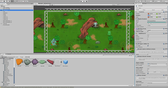
Then the last day arrived, the day of the deadline at 5pm - so I had time to quickly import everything I needed that I managed to produce in the time I had. However, when I asked Martyn about importing the sprite sheet, but he didn't know how to import it either.
However, I managed to import the arch separately and make the layer containing it overlapping Cooper's layer - which makes Cooper go under the arch. And I quickly added Cooper's blue flame to shoot out. So to improve, I should apply more time.
Overall, even though this was least favourite process of production, this allowed me to experience a new method of programming in blocks and assembling the game.
Unity:
Reference:
Unity Technologies (2005) Unity [Computer program]. Available from: https://store.unity.com/download [Downloaded by the college].